UTReader user interface design critique
Before explaining the poorly design, you should be aware of the usage of this application. It is a news reader that captures news limited to UT, for which it is called UTReader.
Generally speaking, my design is not fashion at all. It is not polished up and won’t provide a modern feeling. But that is more like a problem in photoshop. Better quality pictures and icons may help to solve it. However, I did make some mistakes in the perspective of UI design.
Demo
Good Visibility
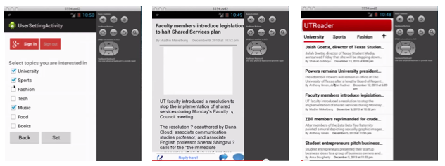
Although not in a good looking, the app keeps a good visibility. When you launch the app, the most informative page is shown and you could directly interact with it to get the news you are interested without thinking for a second. For each row in the list view there is heading, abstract, source, author and date, which are the most important elements of an article.
When you tap a particular news and see its detail information, you will see the full story easily. It is also obvious to guide users to post their comments in the bottom.
In the preference setting page, the checking box and button could not be easier and more clear. (However, it need to be more elegant.)
Suggestion: in the list view of launch page we may add a sqaure image in the left part.
Poor Consistency
From the three screenshots above, you can see that there are read, blue, grey occurred as the main colour. It will easily confuse the user and harm their user experience. The most obvious example is the first picture. With a red Google Plus sign in button, the back and set button are in other colours. In addition, the design definitely failed to follow the android’s latest design style, making it look like an out-of-date application compared to others in the system.
Poor Affordance
When you see the third picture, you may not realise the header row is ready to push as a navigation button because it is simple several words.There is also no guidance for users to touch the news digest to read the details. Maybe an arrow would have better indication. As for the first picture, it is wired that sign in/out button and back/set button occurred at the same time. There lacks description of back/set and the users will be confused about the operations. What should they do? What does back here mean? It is the same thing as the back button which is provided by the virtual button. Should I sign in here or not, why should I sign in?
No comments:
Post a Comment