Monday, March 31, 2014

Design Critique -- UTReader

UTReader user interface design critique

Before explaining the poorly design, you should be aware of the usage of this application. It is a news reader that captures news limited to UT, for which it is called UTReader.


Generally speaking, my design is not fashion at all. It is not polished up and won’t provide a modern feeling. But that is more like a problem in photoshop. Better quality pictures and icons may help to solve it. However, I did make some mistakes in the perspective of UI design. 

Demo


Good Visibility
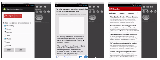
Although not in a good looking, the app keeps a good visibility. When you launch the app, the most informative page is shown and you could directly interact with it to get the news you are interested without thinking for a second. For each row in the list view there is heading, abstract, source, author and date, which are the most important elements of an article.
When you tap a particular news and see its detail information, you will see the full story easily. It is also obvious to guide users to post their comments in the bottom.
In the preference setting page, the checking box and button could not be easier and more clear. (However, it need to be more elegant.)

Suggestion: in the list view of launch page we may add a sqaure image in the left part.


Poor Consistency
From the three screenshots above, you can see that there are read, blue, grey occurred as the main colour. It will easily confuse the user and harm their user experience. The most obvious example is the first picture. With a red Google Plus sign in button, the back and set button are in other colours. In addition, the design definitely failed to follow the android’s latest design style, making it look like an out-of-date application compared to others in the system.

Poor Affordance
When you see the third picture, you may not realise the header row is ready to push as a navigation button because it is simple several words.There is also no guidance for users to touch the news digest to read the details. Maybe an arrow would have better indication. As for the first picture, it is wired that sign in/out button and back/set button occurred at the same time. There lacks description of back/set and the users will be confused about the operations. What should they do? What does back here mean? It is the same thing as the back button which is provided by the virtual button. Should I sign in here or not, why should I sign in? 

Saturday, March 29, 2014

Mobile news I collected from SXSW 2014


Hardware
Oculus
Delivering incredible, affordable, and ubiquitous consumer virtual reality to the world. I've tried the game showed by Oculus Rift in SXSW called "Ascend the Wall". It's really amazing! It create a hard-edged realism, and I can't imagine what the future life will be like with it's development.

Ring
Remote control by move your finger.

Kinoma Create
Just like the popular Raspberry Pi. This is the JavaScript-Powered Internet of Things Construction Kit.

3M-Touch Table
It's not a Touch Screen, but a Touch Film. 3M just want to introduce it's amazing touch film that can make any interface touchable in the future.

Products Made in Japan.
1.Scentee Balloon
Scentee has been created to construct a new form of communication for “a mobile lifestyle using the sense of smell”. The form of communication using “the sense of smell” is something that has yet to be realized despite the ongoing evolution of smartphones.
2. FUKUSHIMA Wheel
Motivate people to use bike more as well as have fun, goal is to protect the environment. 


EPIPHANY EYEWEAR
Different from Google Glass, this one has more specific use.


Olloclip
Power your iPhone to a microscope! This is a mature product, sold well in SXSW trade show.


TOUCHJET
Interactive Android projector with touch interface and wireless streaming. I can play Angry Bird on the wall with that special pen!
Wello
Wello is a health tracker as a phone cover. Simply hold it and hidden sensors begin testing your vitals. This information is then quickly passed to an app that's synced to your phone. Not only do you get an instant idea about your health, over time you are able to see patterns that help you manage your life better.


Software 
Aurasma
Do you know the Häagen-Dazs App? Scan the lid of your ice cream, a violinist will appear and play music. And Aurasma is a augmented reality platform. Aurasma's image recognition technology uses a smartphone's or tablet's camera to recognize real world images and then overlay rich media on top of them in the form of animations, videos, 3D models and web pages. It's a sponsor  of SXSW, I scanned my book with the app, and it show me a long and interesting animation! 

Secret
People always have secrets, and they need a platform to pour out. This app become popular that fill the needs of telling and seeking secrets anonymously.
Secret - Speak Freely


Nipple.io
Well..... I just saw this poster everywhere around SXSW.... And people are talking about it!

Thinglink
Add more information on a picture with a small tag, it could be link/location/anther picture/video/contact and so on. You can put your multi-picture on SNS and check the views of each tag. It runs in iPad,iPhone and Web.

Neon
A Customer Facing platform allows customers to proactively engage with the brand and with measurement allow you to react back. In the picture below, I can directly know the revenue in a 3D model on a phone.


2 Apps for Stars to manage and connect with their fans:
FanCaptain
DropKloud


2 Tools that help you make your own App:
Embarcadero
A software like Xcode, can design and develop an App with different platform (iOS/WP/Android) in one project.
iGENapps
Use this app to make your own mobile app!


Videoshader


2 website/app about Internet privacy

Ghostery

It’s the web’s largest, most comprehensive and most user-friendly privacy tool. An easy add-on for every major browser and available as an iPad and iPhone app, Ghostery helps people around the world understand and control more than 1,900 trackers that are tracking them when they browse.
https://www.ghostery.com

NOTRACE
Contact like an Ninja! It have App and Web edition that allows you send your message anonymously and the content will disappear after been read in 10s.


SPLAT.IN
Birds in Austin. People can join this game by app or web, you will be a bird standing on the wire and shit on the cars or people to win. So much fun when many people play together.

Inspiration of Real birds in Austin (I took this photo in Riverside)

Hipchat
An IM tool for group chatting and connecting.

Tuesday, March 25, 2014

Design Critique – Paper from Fifty Three


Compatibility: Requires iOS 7.0 or later. Compatible with iPad.

Description:
Paper is a good idea-keeper. It can help users to capture the ideas as sketches, diagrams, illustrations, notes or drawings and share them across the web. Paper’s interface design is very impressive for me. I want to demonstrate it in three aspects: visibility, consistency, and conceptual model.

The official website of Fifty Three:
Download link:
Paper Blog:

DESIGN PRINCIPLES
Visibility
“Paper” has a high degree of visibility, which allows the user to work out the current state of the system and the range of actions possible.


For example, when users swipe the screen, the journals will slide to the left or right, the journal which move to the middle will move close to users (it turns bigger). Users can understand that this journal is which they can edit only and immediately. Users can recognize every journal by the name beyond it, and also can get the current state of the page numbers.
Fig.1 visibility
When the journal move to the middle, the small “i“ on the top-right corner of the journal will show up, which will remind users that they can edit the setting of this journal. There are three icons under the journal, which is very easy to understand as the functions of “delete”, “export” and “add a new one”.

As an app for drawing picture, when users enter a single painting page at first time, the tool bar will show up without slide the screen. I think this is also a very thoughtful visibility design for new users who are unfamiliar with this app. Users will not get confused when they start experience this app at very beginning.
Fig.2 visibility of tool bar
What’s more, the small plus sign will show up when you are at the last page of the journal and you slide it to move to the next page. This small sign is very reasonable for users to get a feeling of where they are.
Fig.3
Consistency
This application is internally consistent. Every journal you create has the same structure. Except those journals, the information windows keep a consistent style, such as “Welcome Guide” and “About Paper”. They have same size, same layout, and same fonts.
Fig.4 (a)
Fig.4 (b)
Fig.4 (c)
Besides, there is a collection of good paintings from other users, which named “made with Paper”. Since this is a special part of this app, “made with paper”, keeps a very good consistency in this app. Even it doesn’t look like a notebook, and you cannot open those pieces in full-screen; but the same design of fonts, the similar gesture experience, and the unique animation effect make “made with Paper” fix well in this App.
Fig.5 (a)
Fig.5 (b) 
Conceptual model
Paper presents a perfect conceptual model, which allows the user to build up a true picture of the way the system holds together. Users can add, update and delete the journal in the app. In a journal, user also can edit, add, update and delete every page. For every page, users will have several tools to accomplish their pictures or notes.

Besides, this app maps “undo” with a go-back-in-time clock, maps “zoom out” with a magnifying lens, which are very decent conceptual models.

As a new painter, I always want to undo the lines I made. Instead of using the small undo arrow to achieve this function, Paper designed to accomplish “undo” by a gesture, which asks users using two fingers contra rotate on the screen. On the other word, users can also use two fingers to rewind to any previous point in time without leaving your flow. It is not only convenient for us when draw pictures by fingers, but also making a common sense of “back in time”, which is an essential meaning of “undo”.
Fig.6 (a)
Fig.6 (b)
Users can zoom out the details, like a magnifying lens. This function gives users fast access to deeper levels of the drawing, without losing the place on the page.
Fig.7 
What’s more, users can close a journal by pinching it, page turning by simply swipe it. Tap and hold a single paper, users can pick up a page or journal, pinch and swipe to navigate while moving.

Fig.8 (a)
Fig.8 (b)
Fig.8 (c)
Affordances
This app provides property of objects and environment, which allows users to perform an action. When look at every pen in the tool bar, users can have a perspective, and imagine what kind of stroke the pen has.
Fig.8
The mixer, also meets users real-world experience. The mixer is perfect when users paint between the shades. This is a very natural way to mix beautiful colors, and users can hold the color they create to save it in the palettes. 

Limitations:
When I want to close the small window of information, I cannot just touch the dark area of the screen to return to the main screen.


53 Pencil's connection is not reasonable enough. If I haven’t used the pencil for a long time, I need to activate those tools by connecting the pencil again. However, what if I lost my pencil?

Sunday, March 23, 2014

Mobile News - Android Wear debuts with the LG G Watch and Moto 360

ANDROID WEAR

1. Android wear

Google has revealed Android Wear, the first operating system made exclusively for smartwatches. The OS was first hinted at last week at Google’s SXSW showcase. Now Google has released the software development kit. Along with the release, Google revealed that Android Wear will have multi-screen functionality, full Google Now integration, and health & fitness monitoring. Similar to current smartwatches, Android Wear devices will tell you when to get active and give you daily, weekly, and monthly fitness summaries.

Android Wear: Information that moves with you 
Today we’re announcing Android Wear, a project that extends Android to wearables. And we’re starting with the most familiar wearable—watches. Going well beyond the mere act of just telling you the time, a range of new devices along with an expansive catalogue of apps will give you:

  • Useful information when you need it most. Android Wear shows you info and suggestions you need, right when you need them. The wide variety of Android applications means you’ll receive the latest posts and updates from your favorite social apps, chats from your preferred messaging apps, notifications from shopping, news and photography apps, and more. 
  • Straight answers to spoken questions. Just say “Ok Google” to ask questions, like how many calories are in an avocado, what time your flight leaves, and the score of the game. Or say “Ok Google” to get stuff done, like calling a taxi, sending a text, making a restaurant reservation or setting an alarm. 
  • The ability to better monitor your health and fitness. Hit your exercise goals with reminders and fitness summaries from Android Wear. Your favorite fitness apps can give you real-time speed, distance and time information on your wrist for your run, cycle or walk. 
  • Your key to a multiscreen world. Android Wear lets you access and control other devices from your wrist. Just say “Ok Google” to fire up a music playlist on your phone, or cast your favorite movie to your TV. There’s a lot of possibilities here so we’re eager to see what developers build. 


2. Comparison with PEBBLE


3. LG G & Moto 360

LG says it expects to offer the G Watch in the second quarter of this year while the Moto 360 is expected this summer. Looking at the two you can see one huge difference: The G Watch is rectangular while the Moto 360 is round: Unique for a smartwatch but obviously very common in the watch-wearing world.

While LG hasn’t shared many details, Motorola held a live video interview this week with Motorola’s head of Consumer Experience Design, Jim Wicks. He didn’t provide a close up look at the Moto 360, but was interacting with one on his wrist. He also shared a few details about the watch that weren’t initially provided. For example, the round face is roughly 46 millimeters in diameter and the face will auto-rotate so you can wear it on either wrist.


4. Google Glass


Sunday, March 16, 2014

Design Critique - Notifications bar

Description
Notifications bar is a feature of a mobile phone interface that informs or notifies users of some impending action or change. It can be anything from an update for an app, a new email, a text message, the weather and much more. It allows the user a trampoline to directly access the necessary app when action is required.

Android feature : Top 3 chronologically ordered notifications are visible on the notifications bar from any screen

DESIGN PRINCIPLES
Consistency
The primary design principle met is consistency. Any update or notification from any application on the smartphone will be seen in one common place – the notification bar. The user does not need to specifically open each individual application to check if there are any notifications.

Fig 1 Notifications for different apps are visible in the same screen and grouped by application

Visibility
The notifications bar allows the user to view what the notification is about – for example, the title and sender of an email. This allows the user to decide whether to ignore the notification or to open the application. Once the notification bar is pulled down, the notifications are grouped by application. This neat organized look to the notifications bar is a very appealing feature. Another point that adds to visibility is that the user can pull down the notification bar, view the notifications and roll it back up again to continue with whatever previous application was open. Unless the user taps on a particular notification, simply viewing the notifications does not in any way hinder the user's present application.
Fig 2 Notifications for different apps contain brief messages available from the notifications bar

Feedback
Tiny icons on the status bar are a very good feedback feature. During the use of most fullscreen applications, when a new email or message arrives, the status bar which was previously hidden becomes visible for a short period of time. It contains the icon of the notification along with a short message (as seen in the Fig. 3(a) Message from … and status bar with top 3 other previous notifications in Fig. 3(b)). This is an extremely well designed feature as it allows the user to continue the fullscreen application, say a game, while also scanning the latest update and making a decision whether or not to react to it. 

Fig 3(a) Notification while using gallery Fig 3(b) Top 3 notifications on status bar

I feel that informative feedback is also well thought of in this design. When one touches the status bar, a strip to aid in pulling the notifications page appears. This is intuitive enough to allow people to access their notifications. Touching or tapping on the notification preview/description takes you to the corresponding application while sliding the whole text left or right, removes the notification from the list. A user is able to grab and move the notification to the side to clear it and back to the center if they decide against clearing it. There is a 'clear all' button that is useful if a user wants to ignore all notifications.

Affordances
The notifications bar definitely fulfills all affordances of the feature. It is a summary or notification list that a user can access by tapping on the status bar, and pulling down on a tab. Once the list is pulled out, you can see very well organized and grouped notifications about different applications on your phone. This can be anything from weather or email or text messages. And these change dynamically when a notification comes in. This is why it's easy to understand and perceive the notification list for what it is.

Conceptual Model
In terms of conceptual model, the notifications bar also includes a shortcut to the phone settings. This enables the user to change or modify any setting quickly based on a notification. Some notification bar designs enabling frequent users to use shortcuts. This is available on the samsung smartphone as shown in Fig 4. HTC phone users requires third party application for the same feature. This slightly inconvenient for the HTC phone users.

Fig 4 Quick settings for WiFi, GPS, Sound etc on the notifications screen (usually followed by notifications)

Limitations
The main limitation of this feature that I have encountered is the lack of an undo button for the clear-all button. However, since these notifications are of apps that use the internet a lot, turning on and off the WiFi or mobile internet data often gets back the list of notifications. For an individual notification swiped out of the screen, if the user remembers the application, it is possible to go the application and understand what the notification was about.

Design Critique - Expense Manager Android App


Design Critique - Expense Manager

Markus Hintersteiner
Finance

Needs:
Android 2.3 additionally upwards
Overview:
This app easily helps users manage their expenses on your own mobile phone and can keep track of their finances in a handy way. The basic idea is that each expense is directly assigned to a category to be able to attain detailed statistics as well as helpful insights. Overall, this app enables to monitor/report your complete spending effortlessly based on one month/week/year, and reach your saving goals.

From the design principles
1. High Visibility:
This app keeps the balance of intuitiveness and good-looking; each icon is neat and without redundancy to affect your decision. First, when you begin to use this app, a good instruction tells you where to get started. In Figure 1(a), “Tap to record an expense”. Second, from the swipeable left-side menu, the layout provides an easy access to the five different sections/ functionalities. The icons size is pretty good and each concise icon with “blue color background” informs a user about the current status in Figure 1(b). Also, Overview has an “Arrow” to remind you next step. In Figure 1(b), after you enter “+”, another small window pops up to notify. Second, users can easily understand the meaning of these icons. For example, “Overview” icon in Figure 1(c) allows you to understand the overview of your weekly/monthly/yearly expenses. Fourth, “Expense Manager” uses vivid colors to represent different categories in Figure 1(c). 


Suggestions: If each category can add a picture to represent, the interface will be nicer. Also, each cost only selects from 5 different categories, and users are still unable to create new categories and also cannot create sub-categories.

2. Provide Moderate Feedback:
After you set lock pattern at startup, if a user enters a wrong answer, Expense Manager provides an instant and clear feedback “Sorry, try again”, as shown in Figure 2 (a). Second, if you request an action, simple responses message without tedious and redundant sentences display on the monitor to tell users what they received and how users work on it. In Figure 2 (b), we try to add one transaction, so just press “+” button, and a calculator pop out to ask you to key-in your cost, and press OK, the calculator will disappear and then shows a simple interface to let user type the related spending information in Figure 2 (c). However, Expenses Manager did not provide feedback for ‘delete’ action, but this action is really important, and should provide good feedback for users to think twice. In this app, once you accidentally press “trash can” button to delete an entry, this record will disappear and no any chance to go back. 

3. Moderate Mapping:
In Figure 1(c), the small pictures of overview and budge and distribution buttons are difficult for users to know their function, so this is why the developers still add texts to aid users understand. Second, “Distribution”, the interface uses pie charts to show the percentage of each category of expenses statistics, as shown in Figure 3(a). Also, “statistics”, as shown in Figure 3(b), reports each monthly performance and also can clearly know which month you sent the most or the least and which months you have exceed the budgets so that users can control their expenditures next month. It’s very straightforward feature. Fourth, “Budget”, the interface is clear, and uses light color to show how much money you can spend, and no explanation but users have similar life experiences to understand this function, as shown in Figure 3 (c).
Suggestion: Some people concern the remaining money instead of spending money. If the app can add one more feature to switch them or the remaining money can be transferred to next usage, it will be better. Also, the remaining cost bar should be changed to different colors (now, light grey) or can set a threshold to alert users. If the expenditure has exceeded the limitation, the app can set a warning to users “You spend too much money!” or change to red color.

4. Good Consistency:
The interface design is internally consistent. In Figure 1(c), Figure 3(c) and Figure 4, no matter which functions you use, the design layout of all categories items is the same. Also, if you would to backup/restore your data, the design is the same as uploading data behavior on the desktop, so the users can get the hang of it very soon.
5. No ‘Undo’:
If a user taps ‘OK’ or ‘SAVE’ button by accident, the transaction will be record, but no any ‘back’ button can be used to recover the task.

6. Prevent Errors:
Expenses Manager Offers a history and a user can track history or recover previous versions or change/modify the spending cost and information based on the dates.

7. Provide Shortcuts:
Provide home screen widget for easier and faster usage.

Other Suggestions:
Also, this app really needs some types of synchronization of information between devices; maybe create an account, such as Google plus sign in.
And… not free!