Wednesday, April 16, 2014

Curator_Prototype_Group 5

Curator--Prototype--Group 5


Group Members - Alexandra Young, George Royer, Jiuling Wang

The Curator mobile app’s main objective is to provide location and detailed exhibit information about UT's various on-campus museums. The app is intended to help curious students and out-of-town users alike discover what the UT museums have to offer, as well as provide new ways for museum-goers to interact with specific exhibits.


Link to Prototype: http://4advgr.axshare.com
QR Code: 

Tuesday, April 15, 2014

Design Critique--Yelp

1. Background

   Yelp is an "online urban guide" and business review site.So Yelp has two main functions for users. First, it is a good App to find out lots of kinds of merchants in an area, including restaurants, bars, shopping malls, etc. Users are able to search for a certain merchant he is interested in or a category of merchants to find out what is best for him. Secondly, Yelp has a review and rate system. The registered users can give their reviews about the merchants, and any user can read others’ reviews and the merchant’s rate. These two main functions are valuable to users who have the need to find a merchant.

2. Design Critique

2.1 Focusing on mobile context

 
Figure 1
Figure 2
  Hinman proposed that design should focus on creating experiences that are uniquely mobile. As a mobile App, it will be used in many different contexts. When a user arrives at a place where he is unfamiliar with, he may has a need to find a good restaurant while he is sitting on a bus. The most important thing for him is to locate himself then find a restaurant. As a mobile App, Yelp has the function to locate the device and search merchants nearby(Figure 1&2). This design can meet the user’s need perfectly. When the user wants to know where he is, the locating function, using the character of mobile device, helps the user to know his location. Then the searching nearby function works to give the user all the choices he may be interested in.

2.2 Good Feedback  

Figure 4
Figure 3

Yelp provides good feedback for the users after operation. When the searching results are shown in list, it displays lots of information to users, including merchant’s name and photo, distance, rating, number of reviews, address, price, characters, etc. All of these information are the most important information for users to judge when they have the need to search for some merchants. With these information, users can continue his searching operation without any puzzle. Except for the simple searching operation, it provides a filter function for users to refine the results. During the filter operation, users could make some selections such as choosing a low price, sorting result by rating(Figure 4). After a filtering searching, the user can get the results meet their need. Besides, the filtering condition will be shown on the top of the result, with these feedbacks, the user can understand the searching result clearly.

2.3 Excellent Visibility

Figure 5

    Yelp has good visibility for users. User is able to find out some frequently used buttons(Figure 5), for instance add review, easily at the top of the screen. It is easy for users to find some buttons and understand the meaning of the button.

Go Dutch! Group 6

It's always hard and troublesome to record and split up all the multiple expenses in a trip over a group. It take time to write down them and calculate. Besides, it seems impossible to keep all the receipts for a long trip.

So we are designing a mobile app to help travelers or friends:
  • Easily add participant and expenses to record
  • Specify which people paid for which expense
  • Display which people owe money on which expense
  • Generate a financial report for the whole trip and individual
  • Other helpful tools needed
The ultimate goal is to simplify the process and make sure “Each user easily gets paid back”.


https://ischool.proto.io/player/?id=6b02a90c-fff0-443c-8065-402b833c425f


The Blanton Museum of Art_Prototype_Group 3

The Blanton Museum of Art


Group 3 - Rae Gibbs, Megan Jackson, Asher Johnson


The Blanton Museum of Art mobile app’s main objective is to provide contextual information about the museum’s exhibits. This can be used before, during and after they experience the museum. This app provides an organized and easy way for users to respond and interact with the artwork.


*Note, save link as a shortcut to your home screen to view as an app.

Monday, April 7, 2014

Design Critique--Tencent QQ


1. Introduction


QQ, also called “the MSN killer that’s made in China”, is a free instant messaging software, first released in February 1999 as OICQ. QQ offers a variety of services, including online social games, social website, email, online payment, browser, microblogging, music, shopping, and online chat. It’s easy and useful, and it has been grown up with me. I’ve become a QQ user for nearly ten years and I never hate it. 

To download the international version: http://www.imqq.com/ (International version is in English, and it is a simplified version)


2. Consistency

QQ can be used in multiple operating systems, including Android, iOS, Linux, OSX, Windows, Windows Phone, Windows Mobile/CE, Symbian, Java ME and Web App. QQ has great consistency in different devices. No matter a user logs in QQ on his or her PC, or mobile phone and tablet, he or she will find the general design of QQ is unified. 


QQ also does a good job on synchronization. If a user starts chatting, QQ allows him or her to pick up the chat where the user left off on any devices in the user's ecosystem. The user can easily find the chatting history. An amazing part that I must address is that QQ allows a user to resume an interrupted download when he or she is sharing files with friends. Considering the poor web condition in China, this is really a great job.


3. Affordance

If a user wants to try some new features, he can simply put the mouse over the icon. QQ will give a general description of the function. Once the user clicks the icon, QQ will give guidelines step by step. A user will never feel himself stupid or need extra help. Even my grandma can use it smoothly.

4. Visibility & Mapping


As we can see, QQ puts different icons in different orders. QQ’s related functions are in one row, Tencent’s other products are listed in another row, and settings of the software are put in the bottom. It is quite easy to find what a user wants. Besides, when your mouse leave QQ for some other work, QQ will become invisible, giving you entire desktop to do what you want.


5. Feedback

QQ will give immediate feedback during a user’s operation. For example, I plan to have a video chat with my mum, and send her my recent photos. Once I click the “video” icon, QQ will show me “inviting your mum to have a video chat, invitation accepted, connecting, connected, video quality is good, you’ve been connected for 10:36.” It show me every step and I never feel lost. I drag the photos into the chat window, and I’ll get “the contact is offline or invisible now, would you like to send the files offline?” See? Never lost. After the video chat, QQ will ask me to rate this chat and give my feedback. It feels like I’m really interacting with QQ.

6. Limitations

There are also some limitations I think. QQ develops too many features like online social game, QQ pet, email, news, microblogging, online payment. This may benefit experienced QQ user, but for new users and inexperienced users, useless functions are too many to handle. At the same time, the variety of features make QQ take a great place of computer memory.

For mobile version, the major problem I think is it takes many steps to log out.


Tuesday, April 1, 2014

Mobile News--- Mobile Payments and Google Wallet

1. Mobile Payments

Mobile payment, also referred to as mobile money, mobile money transfer, and mobile wallet generally refer to payment services operated under financial regulation and performed from or via a mobile device.
Financial institutions and credit card companies as well as Internet companies such as Google and a number of mobile communication companies, such as mobile network operators and major telecommunications infrastructure and handset multinationals such as Ericsson have implemented mobile payment solutions.

2. Google Wallet Introduction


3. Google Wallet’s New Update Could Make it One Killer App

On Tuesday, Google announced a new version of its Google Wallet app on Android.
While Google has ventured into the email-based payment method, favoured by PayPal, by integrating payments into Gmail, NFC is still the first and foremost way Google Wallet will be working.
However, while NFC still plays a big role, Google Wallet 3.1 now lets you scan barcodes on products so all Android users can earn points on loyalty cards at checkout.
Speaking over on the Google Commerce blog, director of product management for Google Wallet, Peter Hazelhurst went onto describe this new feature – while also reassuring readers that NFC is still a key piece of technology.
This new tech means that customers can load up their loyalty cards to to their phone and leave them at home while just scanning products on checkout tor earn points.
The tech is even going to be integrated into Google's fantastic Google Now service on Android – alerting users when they could save money with their loyalty card at a nearby store.
It's a great new feature for Google Wallet, one that's sure to increase its adoption rate. The most interesting aspect out of all of this is that due to Apple's reluctance to integrate NFC into the new iPhone 5c and 5s handsets means that Google Wallet can now work on those phones.
That's if Apple let them mind.
It would give iPhone users a reliable payment application that Apple currently doesn't have in place, as the Passbook is really only used for loyalty cards and boarding passes etc.
Do you think this is a smart avenue for Google Wallet to go down?
Could you see its adoption rate increasing when this rolls out as a feature?
link for Google wallet


Monday, March 31, 2014

Design Critique -- UTReader

UTReader user interface design critique

Before explaining the poorly design, you should be aware of the usage of this application. It is a news reader that captures news limited to UT, for which it is called UTReader.


Generally speaking, my design is not fashion at all. It is not polished up and won’t provide a modern feeling. But that is more like a problem in photoshop. Better quality pictures and icons may help to solve it. However, I did make some mistakes in the perspective of UI design. 

Demo


Good Visibility
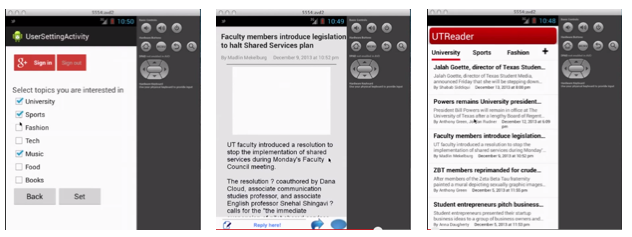
Although not in a good looking, the app keeps a good visibility. When you launch the app, the most informative page is shown and you could directly interact with it to get the news you are interested without thinking for a second. For each row in the list view there is heading, abstract, source, author and date, which are the most important elements of an article.
When you tap a particular news and see its detail information, you will see the full story easily. It is also obvious to guide users to post their comments in the bottom.
In the preference setting page, the checking box and button could not be easier and more clear. (However, it need to be more elegant.)

Suggestion: in the list view of launch page we may add a sqaure image in the left part.


Poor Consistency
From the three screenshots above, you can see that there are read, blue, grey occurred as the main colour. It will easily confuse the user and harm their user experience. The most obvious example is the first picture. With a red Google Plus sign in button, the back and set button are in other colours. In addition, the design definitely failed to follow the android’s latest design style, making it look like an out-of-date application compared to others in the system.

Poor Affordance
When you see the third picture, you may not realise the header row is ready to push as a navigation button because it is simple several words.There is also no guidance for users to touch the news digest to read the details. Maybe an arrow would have better indication. As for the first picture, it is wired that sign in/out button and back/set button occurred at the same time. There lacks description of back/set and the users will be confused about the operations. What should they do? What does back here mean? It is the same thing as the back button which is provided by the virtual button. Should I sign in here or not, why should I sign in?