Showing posts with label design_critique. Show all posts

Wednesday, April 23, 2014

Design Critique - Pocket App

Pocket Website:

1. Description:

Pocket is a mobile app that allows users to sync online content with their mobile phones and desktop computers for reading offline or at a later time. After logging into your Pocket account users are greeted with a full list of pages which can be filtered by article, image, and video view. Visually, the app is a mix of clean whites and shades of gray, which helps to emphasize the colorful thumbnails tied to many of the entries. Pull to refresh allows you to sync with your latest saved articles, and you can swipe on any entry to reveal options to tag, archive, save, trash, or share with other services. This app is great for someone who likes to surf the internet but doesn't always have time to read lengthy articles at their computer.

(Home Screen of Pocket App)

2. Consistency

Pocket has gone through a number of changes since its introduction, making the app highly consistent and easy to navigate, even when using different devices or accessing through a browser. A quick look at the Mac version of this application shows how hard developers have worked to make the user feel as if they are using a unified service. The other element to Pocket that is important to note is that it attempts to remove all formatting from the original article ultimately giving you a better reading experience. This is a highly important element to the success of Pocket because many people are concerned about the clutter of images and advertisements plaguing their reading experience.

(The Mac Version of Pocket Uses a Consistent UI)


3. Visibility

The goal of Pocket is to make navigating through your saved articles easy while also giving you a comfortable environment to read, tag, save, and share with friends. The article view gives the user many options which allow them the change the size, font, color, and brightness of an article in real time. The bottom navigation bar gives you options to move back to your main list, archive, star, and share. In addition, users can switch to "web view" to see the original formatting of their article if they choose.

(Visibility Options on Pocket)

4. Feedback

The Pocket app gives users many options to produce feedback within an article view by allowing them to favorite, mark as read (causing the article to disappear from main view), or share the article via email, or other online social services. By clicking on the "more" button within the share menu a user can set up one of over 30 social sharing applications and customize their sharing menu to display there most used services. The app also lets users tag articles for easier searching and categorization. Once an item is tagged users can filter by that tag, a feature thats nice if you are saving articles for school or work and want to separate them later.


5. Affordances

While there are many applications that allow you to save articles offline for later viewing such as Evernote, Pocket seems to be primarily about the act of reading and this shows in the way the app is designed and presented to users. The bright color scheme and clean lines of Pocket make it easy to navigate and inviting and helps to encourage the user to stay within the app to perform reading tasks.

(Simple and Clean Menu Interface)


6. Conceptual Model

The conceptual model of Pocket is simplicity and this is achieved by the low number of transition screens and initial settings required by the user. More options and views are available to the user but remain hidden behind a menu only for those users who want to go beyond the bare minimum of the apps functionality. What is great about Pocket is that it remains an app for doing a single task. Even when extra features are accessed they still feel as if they are there to aide you in the activity of reading. One such example is the "Highlights" feature which has categories like best of, quick reads, and long reads. Helping the user parse out the length of content allows them to make better decisions based on the amount of time they have to read (for example, if they are on a bus for 10 minutes). These features feel useful and never get in the way of the overall goal. 

(Highlights Menu Option)

7. Limitations

The limitations of Pocket have mainly to do with restrictions set by operating system makers such as Apple which do not allow for deep integration with these services. To get around this problem Pocket has devised bookmarks which use javascript to forward the article to the service. This workaround is efficient but somewhat clunky and could be improved only if Apple opened up the sharing API. One other limitation is the push of sponsored content atop the article and video views of the app. This is most likely a way for Pocket to produce revenue and is less of a limitation and more of a small annoyance. 


Tuesday, April 15, 2014

Design Critique--Yelp

1. Background

   Yelp is an "online urban guide" and business review site.So Yelp has two main functions for users. First, it is a good App to find out lots of kinds of merchants in an area, including restaurants, bars, shopping malls, etc. Users are able to search for a certain merchant he is interested in or a category of merchants to find out what is best for him. Secondly, Yelp has a review and rate system. The registered users can give their reviews about the merchants, and any user can read others’ reviews and the merchant’s rate. These two main functions are valuable to users who have the need to find a merchant.

2. Design Critique

2.1 Focusing on mobile context

 
Figure 1
Figure 2
  Hinman proposed that design should focus on creating experiences that are uniquely mobile. As a mobile App, it will be used in many different contexts. When a user arrives at a place where he is unfamiliar with, he may has a need to find a good restaurant while he is sitting on a bus. The most important thing for him is to locate himself then find a restaurant. As a mobile App, Yelp has the function to locate the device and search merchants nearby(Figure 1&2). This design can meet the user’s need perfectly. When the user wants to know where he is, the locating function, using the character of mobile device, helps the user to know his location. Then the searching nearby function works to give the user all the choices he may be interested in.

2.2 Good Feedback  

Figure 4
Figure 3

Yelp provides good feedback for the users after operation. When the searching results are shown in list, it displays lots of information to users, including merchant’s name and photo, distance, rating, number of reviews, address, price, characters, etc. All of these information are the most important information for users to judge when they have the need to search for some merchants. With these information, users can continue his searching operation without any puzzle. Except for the simple searching operation, it provides a filter function for users to refine the results. During the filter operation, users could make some selections such as choosing a low price, sorting result by rating(Figure 4). After a filtering searching, the user can get the results meet their need. Besides, the filtering condition will be shown on the top of the result, with these feedbacks, the user can understand the searching result clearly.

2.3 Excellent Visibility

Figure 5

    Yelp has good visibility for users. User is able to find out some frequently used buttons(Figure 5), for instance add review, easily at the top of the screen. It is easy for users to find some buttons and understand the meaning of the button.

Monday, April 7, 2014

Design Critique--Tencent QQ


1. Introduction


QQ, also called “the MSN killer that’s made in China”, is a free instant messaging software, first released in February 1999 as OICQ. QQ offers a variety of services, including online social games, social website, email, online payment, browser, microblogging, music, shopping, and online chat. It’s easy and useful, and it has been grown up with me. I’ve become a QQ user for nearly ten years and I never hate it. 

To download the international version: http://www.imqq.com/ (International version is in English, and it is a simplified version)


2. Consistency

QQ can be used in multiple operating systems, including Android, iOS, Linux, OSX, Windows, Windows Phone, Windows Mobile/CE, Symbian, Java ME and Web App. QQ has great consistency in different devices. No matter a user logs in QQ on his or her PC, or mobile phone and tablet, he or she will find the general design of QQ is unified


QQ also does a good job on synchronization. If a user starts chatting, QQ allows him or her to pick up the chat where the user left off on any devices in the user's ecosystem. The user can easily find the chatting history. An amazing part that I must address is that QQ allows a user to resume an interrupted download when he or she is sharing files with friends. Considering the poor web condition in China, this is really a great job.


3. Affordance

If a user wants to try some new features, he can simply put the mouse over the icon. QQ will give a general description of the function. Once the user clicks the icon, QQ will give guidelines step by step. A user will never feel himself stupid or need extra help. Even my grandma can use it smoothly.

4. Visibility & Mapping


As we can see, QQ puts different icons in different orders. QQ’s related functions are in one row, Tencent’s other products are listed in another row, and settings of the software are put in the bottom. It is quite easy to find what a user wants. Besides, when your mouse leave QQ for some other work, QQ will become invisible, giving you entire desktop to do what you want.


5. Feedback

QQ will give immediate feedback during a user’s operation. For example, I plan to have a video chat with my mum, and send her my recent photos. Once I click the “video” icon, QQ will show me “inviting your mum to have a video chat, invitation accepted, connecting, connected, video quality is good, you’ve been connected for 10:36.” It show me every step and I never feel lost. I drag the photos into the chat window, and I’ll get “the contact is offline or invisible now, would you like to send the files offline?” See? Never lost. After the video chat, QQ will ask me to rate this chat and give my feedback. It feels like I’m really interacting with QQ.

6. Limitations

There are also some limitations I think. QQ develops too many features like online social game, QQ pet, email, news, microblogging, online payment. This may benefit experienced QQ user, but for new users and inexperienced users, useless functions are too many to handle. At the same time, the variety of features make QQ take a great place of computer memory.

For mobile version, the major problem I think is it takes many steps to log out.


Monday, March 31, 2014

Design Critique -- UTReader

UTReader user interface design critique

Before explaining the poorly design, you should be aware of the usage of this application. It is a news reader that captures news limited to UT, for which it is called UTReader.


Generally speaking, my design is not fashion at all. It is not polished up and won’t provide a modern feeling. But that is more like a problem in photoshop. Better quality pictures and icons may help to solve it. However, I did make some mistakes in the perspective of UI design. 

Demo


Good Visibility
Although not in a good looking, the app keeps a good visibility. When you launch the app, the most informative page is shown and you could directly interact with it to get the news you are interested without thinking for a second. For each row in the list view there is heading, abstract, source, author and date, which are the most important elements of an article.
When you tap a particular news and see its detail information, you will see the full story easily. It is also obvious to guide users to post their comments in the bottom.
In the preference setting page, the checking box and button could not be easier and more clear. (However, it need to be more elegant.)

Suggestion: in the list view of launch page we may add a sqaure image in the left part.


Poor Consistency
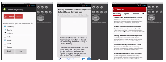
From the three screenshots above, you can see that there are read, blue, grey occurred as the main colour. It will easily confuse the user and harm their user experience. The most obvious example is the first picture. With a red Google Plus sign in button, the back and set button are in other colours. In addition, the design definitely failed to follow the android’s latest design style, making it look like an out-of-date application compared to others in the system.

Poor Affordance
When you see the third picture, you may not realise the header row is ready to push as a navigation button because it is simple several words.There is also no guidance for users to touch the news digest to read the details. Maybe an arrow would have better indication. As for the first picture, it is wired that sign in/out button and back/set button occurred at the same time. There lacks description of back/set and the users will be confused about the operations. What should they do? What does back here mean? It is the same thing as the back button which is provided by the virtual button. Should I sign in here or not, why should I sign in? 

Tuesday, March 25, 2014

Design Critique – Paper from Fifty Three


Compatibility: Requires iOS 7.0 or later. Compatible with iPad.

Description:
Paper is a good idea-keeper. It can help users to capture the ideas as sketches, diagrams, illustrations, notes or drawings and share them across the web. Paper’s interface design is very impressive for me. I want to demonstrate it in three aspects: visibility, consistency, and conceptual model.

The official website of Fifty Three:
Download link:
Paper Blog:

DESIGN PRINCIPLES
Visibility
“Paper” has a high degree of visibility, which allows the user to work out the current state of the system and the range of actions possible.


For example, when users swipe the screen, the journals will slide to the left or right, the journal which move to the middle will move close to users (it turns bigger). Users can understand that this journal is which they can edit only and immediately. Users can recognize every journal by the name beyond it, and also can get the current state of the page numbers.
Fig.1 visibility
When the journal move to the middle, the small “i“ on the top-right corner of the journal will show up, which will remind users that they can edit the setting of this journal. There are three icons under the journal, which is very easy to understand as the functions of “delete”, “export” and “add a new one”.

As an app for drawing picture, when users enter a single painting page at first time, the tool bar will show up without slide the screen. I think this is also a very thoughtful visibility design for new users who are unfamiliar with this app. Users will not get confused when they start experience this app at very beginning.
Fig.2 visibility of tool bar
What’s more, the small plus sign will show up when you are at the last page of the journal and you slide it to move to the next page. This small sign is very reasonable for users to get a feeling of where they are.
Fig.3
Consistency
This application is internally consistent. Every journal you create has the same structure. Except those journals, the information windows keep a consistent style, such as “Welcome Guide” and “About Paper”. They have same size, same layout, and same fonts.
Fig.4 (a)
Fig.4 (b)
Fig.4 (c)
Besides, there is a collection of good paintings from other users, which named “made with Paper”. Since this is a special part of this app, “made with paper”, keeps a very good consistency in this app. Even it doesn’t look like a notebook, and you cannot open those pieces in full-screen; but the same design of fonts, the similar gesture experience, and the unique animation effect make “made with Paper” fix well in this App.
Fig.5 (a)
Fig.5 (b) 
Conceptual model
Paper presents a perfect conceptual model, which allows the user to build up a true picture of the way the system holds together. Users can add, update and delete the journal in the app. In a journal, user also can edit, add, update and delete every page. For every page, users will have several tools to accomplish their pictures or notes.

Besides, this app maps “undo” with a go-back-in-time clock, maps “zoom out” with a magnifying lens, which are very decent conceptual models.

As a new painter, I always want to undo the lines I made. Instead of using the small undo arrow to achieve this function, Paper designed to accomplish “undo” by a gesture, which asks users using two fingers contra rotate on the screen. On the other word, users can also use two fingers to rewind to any previous point in time without leaving your flow. It is not only convenient for us when draw pictures by fingers, but also making a common sense of “back in time”, which is an essential meaning of “undo”.
Fig.6 (a)
Fig.6 (b)
Users can zoom out the details, like a magnifying lens. This function gives users fast access to deeper levels of the drawing, without losing the place on the page.
Fig.7 
What’s more, users can close a journal by pinching it, page turning by simply swipe it. Tap and hold a single paper, users can pick up a page or journal, pinch and swipe to navigate while moving.

Fig.8 (a)
Fig.8 (b)
Fig.8 (c)
Affordances
This app provides property of objects and environment, which allows users to perform an action. When look at every pen in the tool bar, users can have a perspective, and imagine what kind of stroke the pen has.
Fig.8
The mixer, also meets users real-world experience. The mixer is perfect when users paint between the shades. This is a very natural way to mix beautiful colors, and users can hold the color they create to save it in the palettes. 

Limitations:
When I want to close the small window of information, I cannot just touch the dark area of the screen to return to the main screen.


53 Pencil's connection is not reasonable enough. If I haven’t used the pencil for a long time, I need to activate those tools by connecting the pencil again. However, what if I lost my pencil?

Sunday, March 16, 2014

Design Critique - Notifications bar

Description
Notifications bar is a feature of a mobile phone interface that informs or notifies users of some impending action or change. It can be anything from an update for an app, a new email, a text message, the weather and much more. It allows the user a trampoline to directly access the necessary app when action is required.

Android feature : Top 3 chronologically ordered notifications are visible on the notifications bar from any screen

DESIGN PRINCIPLES
Consistency
The primary design principle met is consistency. Any update or notification from any application on the smartphone will be seen in one common place – the notification bar. The user does not need to specifically open each individual application to check if there are any notifications.

Fig 1 Notifications for different apps are visible in the same screen and grouped by application

Visibility
The notifications bar allows the user to view what the notification is about – for example, the title and sender of an email. This allows the user to decide whether to ignore the notification or to open the application. Once the notification bar is pulled down, the notifications are grouped by application. This neat organized look to the notifications bar is a very appealing feature. Another point that adds to visibility is that the user can pull down the notification bar, view the notifications and roll it back up again to continue with whatever previous application was open. Unless the user taps on a particular notification, simply viewing the notifications does not in any way hinder the user's present application.
Fig 2 Notifications for different apps contain brief messages available from the notifications bar

Feedback
Tiny icons on the status bar are a very good feedback feature. During the use of most fullscreen applications, when a new email or message arrives, the status bar which was previously hidden becomes visible for a short period of time. It contains the icon of the notification along with a short message (as seen in the Fig. 3(a) Message from … and status bar with top 3 other previous notifications in Fig. 3(b)). This is an extremely well designed feature as it allows the user to continue the fullscreen application, say a game, while also scanning the latest update and making a decision whether or not to react to it. 

Fig 3(a) Notification while using gallery Fig 3(b) Top 3 notifications on status bar

I feel that informative feedback is also well thought of in this design. When one touches the status bar, a strip to aid in pulling the notifications page appears. This is intuitive enough to allow people to access their notifications. Touching or tapping on the notification preview/description takes you to the corresponding application while sliding the whole text left or right, removes the notification from the list. A user is able to grab and move the notification to the side to clear it and back to the center if they decide against clearing it. There is a 'clear all' button that is useful if a user wants to ignore all notifications.

Affordances
The notifications bar definitely fulfills all affordances of the feature. It is a summary or notification list that a user can access by tapping on the status bar, and pulling down on a tab. Once the list is pulled out, you can see very well organized and grouped notifications about different applications on your phone. This can be anything from weather or email or text messages. And these change dynamically when a notification comes in. This is why it's easy to understand and perceive the notification list for what it is.

Conceptual Model
In terms of conceptual model, the notifications bar also includes a shortcut to the phone settings. This enables the user to change or modify any setting quickly based on a notification. Some notification bar designs enabling frequent users to use shortcuts. This is available on the samsung smartphone as shown in Fig 4. HTC phone users requires third party application for the same feature. This slightly inconvenient for the HTC phone users.

Fig 4 Quick settings for WiFi, GPS, Sound etc on the notifications screen (usually followed by notifications)

Limitations
The main limitation of this feature that I have encountered is the lack of an undo button for the clear-all button. However, since these notifications are of apps that use the internet a lot, turning on and off the WiFi or mobile internet data often gets back the list of notifications. For an individual notification swiped out of the screen, if the user remembers the application, it is possible to go the application and understand what the notification was about.

Design Critique - Expense Manager Android App


Design Critique - Expense Manager

Markus Hintersteiner
Finance

Needs:
Android 2.3 additionally upwards
Overview:
This app easily helps users manage their expenses on your own mobile phone and can keep track of their finances in a handy way. The basic idea is that each expense is directly assigned to a category to be able to attain detailed statistics as well as helpful insights. Overall, this app enables to monitor/report your complete spending effortlessly based on one month/week/year, and reach your saving goals.

From the design principles
1. High Visibility:
This app keeps the balance of intuitiveness and good-looking; each icon is neat and without redundancy to affect your decision. First, when you begin to use this app, a good instruction tells you where to get started. In Figure 1(a), “Tap to record an expense”. Second, from the swipeable left-side menu, the layout provides an easy access to the five different sections/ functionalities. The icons size is pretty good and each concise icon with “blue color background” informs a user about the current status in Figure 1(b). Also, Overview has an “Arrow” to remind you next step. In Figure 1(b), after you enter “+”, another small window pops up to notify. Second, users can easily understand the meaning of these icons. For example, “Overview” icon in Figure 1(c) allows you to understand the overview of your weekly/monthly/yearly expenses. Fourth, “Expense Manager” uses vivid colors to represent different categories in Figure 1(c). 


Suggestions: If each category can add a picture to represent, the interface will be nicer. Also, each cost only selects from 5 different categories, and users are still unable to create new categories and also cannot create sub-categories.

2. Provide Moderate Feedback:
After you set lock pattern at startup, if a user enters a wrong answer, Expense Manager provides an instant and clear feedback “Sorry, try again”, as shown in Figure 2 (a). Second, if you request an action, simple responses message without tedious and redundant sentences display on the monitor to tell users what they received and how users work on it. In Figure 2 (b), we try to add one transaction, so just press “+” button, and a calculator pop out to ask you to key-in your cost, and press OK, the calculator will disappear and then shows a simple interface to let user type the related spending information in Figure 2 (c). However, Expenses Manager did not provide feedback for ‘delete’ action, but this action is really important, and should provide good feedback for users to think twice. In this app, once you accidentally press “trash can” button to delete an entry, this record will disappear and no any chance to go back. 

3. Moderate Mapping:
In Figure 1(c), the small pictures of overview and budge and distribution buttons are difficult for users to know their function, so this is why the developers still add texts to aid users understand. Second, “Distribution”, the interface uses pie charts to show the percentage of each category of expenses statistics, as shown in Figure 3(a). Also, “statistics”, as shown in Figure 3(b), reports each monthly performance and also can clearly know which month you sent the most or the least and which months you have exceed the budgets so that users can control their expenditures next month. It’s very straightforward feature. Fourth, “Budget”, the interface is clear, and uses light color to show how much money you can spend, and no explanation but users have similar life experiences to understand this function, as shown in Figure 3 (c).
Suggestion: Some people concern the remaining money instead of spending money. If the app can add one more feature to switch them or the remaining money can be transferred to next usage, it will be better. Also, the remaining cost bar should be changed to different colors (now, light grey) or can set a threshold to alert users. If the expenditure has exceeded the limitation, the app can set a warning to users “You spend too much money!” or change to red color.

4. Good Consistency:
The interface design is internally consistent. In Figure 1(c), Figure 3(c) and Figure 4, no matter which functions you use, the design layout of all categories items is the same. Also, if you would to backup/restore your data, the design is the same as uploading data behavior on the desktop, so the users can get the hang of it very soon.
5. No ‘Undo’:
If a user taps ‘OK’ or ‘SAVE’ button by accident, the transaction will be record, but no any ‘back’ button can be used to recover the task.

6. Prevent Errors:
Expenses Manager Offers a history and a user can track history or recover previous versions or change/modify the spending cost and information based on the dates.

7. Provide Shortcuts:
Provide home screen widget for easier and faster usage.

Other Suggestions:
Also, this app really needs some types of synchronization of information between devices; maybe create an account, such as Google plus sign in.
And… not free!