Started in 2007, Netflix has grown to become a household name for on-demand entertainment. In the beginning, Netflix was purely a dvd rental service, but has grown into a streaming service. Users subscribe to the service to stream movies and TV shows to their chosen device.
Using the design principles of consistency, visibility, affordances, and conceptual model, Netflix’s iPhone app utilizes a straightforward interface that allows users to focus on the content they want, rather than how to obtain it.
CONCEPTUAL MODEL
In practicing the principle of having an easy conceptual model for the user to understand, Netflix’s interface keeps the number of state-to-state transitions low and simple to grasp. When the user opens the app, they first login, then select one of the profiles they’ve created for different members of their family, and then pick one of the available movies to watch from various categories. Rather than create several menus for various possible categories that take you to separate pages, Netflix created a simple one-page interface for browsing movies that is easy to remember and simplifies the user’s process.
VISIBILITY
The iPhone app practices excellent visibility by highlighting movie choices with their DVD artwork, much like a user would see at a movie rental store, such as Blockbuster. The user can quickly decide if this movie is interesting just by glancing at the associated artwork, rather than reading a list of titles. Seeing a representation of the movie with its artwork allows the user to clearly choose a movie and launch directly into it.
AFFORDANCES
The app’s affordances are well designed; the user doesn’t have to question the way they can interact with the application. When a user is selecting a movie, it is clear that scrolling the icons left and right will reveal more options. Once a user has selected a movie, the user has full control of playback and can interact with it much like any other video application. Instead of providing ambiguous controls, the application lets users quickly navigate with natural interactions.
CONSISTENCY
The iPhone app interface is consistent with the interfaces of other devices. All of Netflix’s apps utilize the same conceptual model of steps: first login, select who’s using the app, then pick something to watch. Even better, Netflix remembers where you stopped watching your movie across all of a user’s devices. No matter which device the user picks up, they encounter the same consistent experience. This allows users to go from device to device without focusing on figuring out what to click, it becomes second nature to select the movie they want to watch.
Originally published: Feb 25, 2014 Reposted from UIE blog
This article was originally published January 3, 2013 on the Cloud Four Blog.
A few months ago I was tasked with finding a good solution for a client
who wanted to move to responsive design, but had a web app that they
needed to support as well. The question they asked is one that I’ve seen
others argue about in the past: does responsive design make sense for
apps?
In this case, the client was using a JavaScript UI framework from Telerik. This framework has been deprecated in favor of Kendo UI.
Kendo UI follows a pattern that I see for many of these frameworks: there are desktop widgets and mobile widgets. The same is true of nearly every framework that I could find:
The pattern seems clear at least from a framework perspective. There are
widgets for desktop web development and widgets for mobile. They look
and behave differently.
But does that make sense? Is that where things will head in the long run?
Why aren’t these frameworks responsive?
I know within these frameworks, that portions are responsive. jQuery
Mobile, for example, is designed to be responsive. But there is still a
separation between the mobile/tablet UIs of jQuery Mobile and the
desktop widgets of jQuery UI. Why is that the case?
When it comes to Kendo UI, we know what the developers are thinking. They wrote about their thoughts on responsive design back in September:
Responsive design is great for creating mobile sites, but it’s not as
useful for creating mobile apps. Responsive design can help you hide,
show, resize, and reformat UI for screens of varying size, but it is
less suited for presenting completely different modes of usability on
different form factors.
On the face, it seems like a reasonable enough argument. But what stuck
in my craw was something else they wrote about why they have a
separation of tablet UI versus phone UI:
It’s not that we’re technically incapable, but adapting a phone UI to a
tablet UI is not so dissimilar from trying to automatically adapt
desktop UI to a phone. They are fundamentally different platforms with
different usability considerations, and something that makes sense on
phones may or may not belong on tablets.
These two sentences struck me as odd and difficult to reconcile with
what we’ve seen happen in the market over the last few months.
Where is the line between tablets and phones?
So what separates a phone from a tablet? I’m going to assume they’re not
talking about the fact that one can make phone calls and the other
cannot.
In truth, I don’t know why the Kendo UI folks think the platforms are different1
. What I can say is that when the iPad came out, the lesson was clear
that simply increasing the size of an iPhone app to make it fit on a 10″
screen was not sufficient. And since then, I’ve heard a lot of people
talk about how tablets are different than phones.
So let’s assume for a second that the major difference is screen real
estate because so many other things are similar (touch screens,
operating system, etc. are all consistent between phones and tablets).
Let’s take a closer look at screen real estate:2
In the table above, I’ve picked some of the larger phones and smaller
tablets. It seems that phones stop at around 5 inch displays and tablets
pick up at 7 inches. So there is a gap in physical size between the two
device classes-even if that gap is getting smaller over time.
But for web developers, the screen resolution-and more specifically the
viewport size-make a bigger difference than the physical size. And when
it comes to viewport size, the differences between tablets and phones
are less clear.
Quick, without looking at the table above, identify which of the
following viewport measurements belongs to a phone and which belongs to a
tablet:
640 px
600 px
519 px
640 px
622 px
533 px
812 px
Can’t tell the difference can you?
Those of you paying close attention will notice that I used the widths
of tablets and the heights of phones. Now before you accuse me of
cheating, do you really think no one uses their phone in landscape
orientation?
(Quiz answers: Phones-1,3,4,7; Tablets-2,5,6)
Is tablet UI different than phone UI?
So it is true that phones and tablets “are fundamentally different
platforms with different usability considerations, and something that
makes sense on phones may or may not belong on tablets”?
Fundamentally different? With the exception of the ability to make a
call, the data suggests that they’re aren’t so different and that the
differences between phones and tablets are narrowing all the time.
Ok, but desktop UI is definitely different, right?
Surely desktop is different, right? Every JavaScript framework that I
looked at makes a distinction between mobile and desktop. Even Apple has
different SDKs for iOS and OS X.
This seems to be the common opinion particularly when it comes to building intranet or enterprise applications that “will only be used on desktop”.
Earlier this year, my friend Boris Smus made a compelling argument for why web apps need more than media queries:
To create a good user experience, you need to know who your users are
and what devices they are using. If you build a user interface for a
desktop user with a mouse and a keyboard and give it to a smartphone
user, your interface will be a frustration because it’s designed for
another screen size, and another input modality.
I highly recommend reading Boris’s article because he does a good job of
describing a method for classifying devices into form factors not based
on whether they are sold as a “phone” or a “desktop computer”, but
instead based on the characteristics of the device.
Boris offers a middle ground between responsive design and separate code bases for every device:
Here’s a compromise: classify devices into categories, and design the
best possible experience for each category. What categories you choose
depend on your product and target user. Here’s a sample classification
that nicely spans popular web-capable devices that exist today.
small screens + touch (mostly phones)
large screens + touch (mostly tablets)
large screens + keyboard/mouse (mostly desktops/laptops)
This made a lot of sense to me at the time. Designing a complex
application that is finely tuned to keep someone in the flow while
working with a keyboard and mouse is different than designing something
tuned to touch.
That is, it made a lot of sense to me until…
Windows 8 obliterates the distinctions between tablets and desktop
this unspoken agreement to pretend that we had a certain size. And that
size changed over the years. For a while, we all sort of tacitly agreed
that 640 by 480 was the right size, and then later than changed to
800:600, and 1024; we seem to have settled on this 960 pixel as being
this like, default. It’s still unknown. We still don’t know the size of
the browser; it’s just like this consensual hallucination that we’ve all
agreed to participate in: “Let’s assume the browser has a browser width
of at least 960 pixels.”
I’ve always loved this idea of a consensual hallucination that all we
all agreed to participate in. I still remember nervously presenting work
to clients or bosses and hoping that they had their browser set to the
default font. I crossed my fingers and hoped they also believed in the
hallucination that people didn’t adjust the font size in their browser.
I bring this up because we have a similar consensual hallucination about
the distinctions between tablets and desktop. At the same event that
Steve Jobs introduced the iPad, he also unveiled the iPad Keyboard Dock.
How many people have you seen carrying an iPad case with a built-in
keyboard? I was in a meeting recently where nearly everyone in the room
had iPads with keyboards.
Yet, in our collective hallucination, we believe large screen and touch
equals tablet whereas large screen plus keyboard and mouse equals
desktop.
Jeremy points out that mobile didn’t create more unknowns for web
designers. It just forced us to recognize the unknowns that were already
there.
The same is true of Windows 8. Our illusion that there are sharp
differences between tablets and desktop is destroyed by a whole slew of
devices that can change between tablets and desktop machines on a whim.
And it’s not just these laptops/tablet hybrids that break our
preconceived notions of what desktop means. Many manufacturers are also
producing Windows 8 desktop computers that feature touch screens. Or
touch screen monitors that can be added to any Windows 8 machine.
And just to confuse things further, Ubuntu is introducing phones that act like desktop computers when docked.
Touchscreens on desktop are just a fad, right?
I’ve seen a fair amount of criticism of Microsoft for incorporating touchscreens into their laptops and desktop devices. Jon Gruber wrote:
A touch-optimized UI makes no more sense for a non-touch desktop than a
desktop UI makes for a tablet. Apple has it right: a touch UI for touch
devices, a pointer UI for pointer (trackpad, mouse) devices. Windows 8
strikes me as driven by dogma - “one Windows, everywhere”.
Windows 8 may not have all of the pieces worked out yet, but I believe
they are on the right track and Apple will follow suit at some point.
Intel has published detailed findings of their usability studies of touch on notebook computers:
Users who were presented with a way to interact with their computers via
touch, keyboard, and mouse found it an extremely natural and fluid way
of working. One user described it using the Italian word
simpatico-literally, that her computer was in tune with her and
sympathetic to her demands.
They go on to dispute the conventional wisdom that people get fatigued
using touchscreens. The people who I’ve talked to who have Windows 8
touchscreens talk about how natural it is and how quickly they stopped
thinking about it and just flow from using their trackpad or mouse to
touching the screen. They say simply, “Don’t knock it until you try it.”
Device interaction by input type.
And really, why wouldn’t this be true? We’ve seen children who are
confused that computer screens don’t respond to touch the same way the
other screens around them do. We laugh at ourselves when we
absentmindedly reach out and touch our screen expecting it to do
something.
We call these touch interfaces natural user interfaces. Is it any
surprise then that we would want these interfaces on our desktop
machines as well?
Touch as a baseline experience
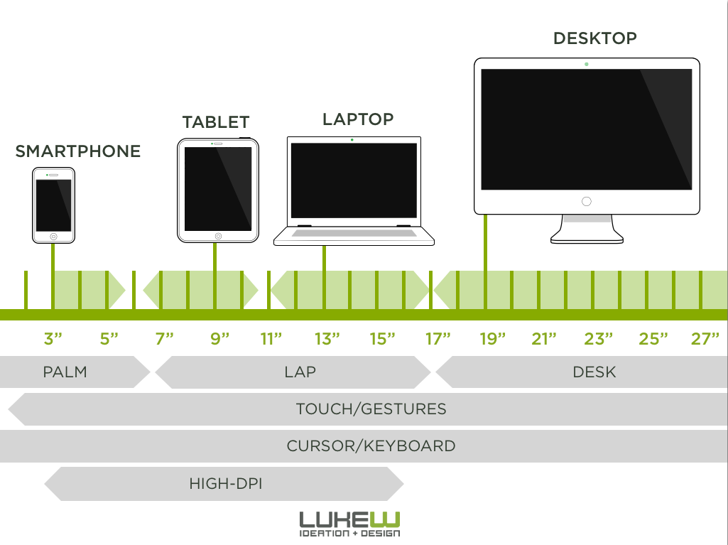
Luke Wroblewski has neatly summarized our current device landscape in a single graphic:
We have devices at nearly every screen size and we have multiple types
of input at each resolution. The small gaps that exist are either things
that seem inevitable (high-dpi on large screens) or are so small to be
inconsequential (does it matter that we don’t have six inch displays?).
Luke produced an under-appreciated series of videos for Intel that take a closer look at what it means to design applications for these new class of touch laptops. In that series, he looks at what it would mean to design for targets for mouse versus touch:
In the video, Luke makes the point that an app designed with targets
appropriate for a keyboard/mouse UI will be difficult for someone to
interact with using touch. But the opposite isn’t the case. If targets
are designed for touch, they will by necessity be larger and will be
easier for all users to hit due to Fitt’s Law.
Josh Clark came to a similar realization recently and argues that Every Desktop Design Has To Go Finger-Friendly.
To me, it seems like nearly every lesson we’ve learned about designing
for mobile and tablets-whether it is designing larger targets for touch,
using larger typefaces for readability, or simplifying interfaces-are
things that desktop applications can benefit from. And this is why you
see both Apple and Microsoft incorporating the lessons learned from
mobile into their desktop operating systems.
Perhaps in the past desktop UI was something completely different from mobile UI, but that is no longer the case.
Lines in the sand do not persist
Any attempt to draw a line around a particular device class has as much
permanence as a literal line in the sand. Pause for a moment and the
line blurs. Look away and it will be gone.
Let’s take the absolute best case scenario. You’re building a web app
for internal users for whom you get to specify what computer is
purchased and used. You can specify the browser, the monitor size,
keyboard, etc.
How long do you think that hardware will be able to be found? Three
years from now when a computer dies and has to be replaced, what are the
chances that the new monitor will be a touchscreen?
By making a decision to design solely for a “desktop UI”, you are
creating technical debt and limiting the longevity of the app you’re
building. You’re designing to a collective hallucination. You don’t have
to have a crystal ball to see where things are headed.
And once you start accepting the reality that the lines inside form
factors are as blurry as the lines between them, then responsiveness
becomes a necessity.
I’m not saying there isn’t usefulness in device detection or looking for
ways to enhance the experience for specific form factors and inputs.
This isn’t a declaration that everything must be built to be with a
single html document across all user agents.
What I am saying is that even in scenarios where you’re fine-tuning your
app code and UI as much as possible for a form factor, that the
differences in screen size and the various forms of input within a form
factor alone will be enough to require you to design in a responsive
fashion.
And once you start designing in a responsive fashion for a given UI
widget, you’re going to find that you have to think about what happens
to that widget across a wide range of screen resolutions.
To do otherwise means ignoring the reality of our device landscape and requires you to buy into a collective hallucination.
This is your last chance. After this, there is no turning back. You take
the blue pill- the story ends, you wake up in your bed and believe
whatever you want to believe. You take the red pill- you stay in
Wonderland, and I show you how deep the rabbit hole goes.
I worry that it will seem like I’m picking on the Kendo UI folks, but
that isn’t what I set out to do. It just so happens that our client was
using their tools and my investigation started with their framework.
Their article on responsive design spurred a ton of thought which I’ve
captured here.
FWIW, I think the tools they provide are pretty damn cool, and we’re all still grappling with what Windows 8 means for us.
Finding viewport sizes for all of these devices proved difficult. If there is an error, please let me know.
Want to learn more?
When it comes to incorporating and understanding mobile first
responsive design, Jason Grigsby is one of the UX superstars to turn to.
That's why we've asked him to do a full-day workshop at this year's UX Immersion Mobile Conference, April 7-9 in Denver, CO.
About the Author
Jason co-founded Cloud Four, a mobile design and development agency, and founded Mobile Portland to educate and support Portland’s mobile community. He also co-authored a book, Head First Mobile Web. You can follow Jason on Twitter at @grigs.
Below we feature the six UX luminaries giving full-day workshops at the UX Immersion Mobile Conference,
April 7-9 in Denver, CO. Each of these podcasts brings insights on how
to improve communication and workflow with your team and users.
Structuring Your Workflow for Responsive Web Design by Ben Callahan
With the need for the web to reconfigure and adapt to different devices
and displays, designers and developers need to adapt to changing
workflows. Ben discusses how to move towards an iterative and
collaborative approach which in turn allows your clients to become more
involved in the process. Listen to Ben’s podcast.
The Challenges of Usability Testing Mobile Apps by Cyd Harrell
Cyd Harrell has developed some good remote usability techniques that can
be more effective, both in scope and cost as well as results, than a
formal testing lab.( Even something as simple as “hugging” a laptop with
the screen angled away from you and using the built in camera can give
fantastic insights into how a user will interact with a mobile device.) Listen to Cyd’s podcast.
Creating Responsive Interfaces by Brad Frost
Frameworks and design patterns are no strangers in the world of web
design. As responsive web design becomes common practice, making sure
these templates work across every imaginable screen and device is
trickier. Brad shares his concept of Atomic Design to tackle this
challenge. Listen to Brad’s podcast.
Responsive Web Design with Mobile in Mind by Jason Grigsby
The ability for your site to display across screen sizes and devices,
reduces development time and allows for one design to work anywhere.
Jason the total experience of your site is more than just what it looks
like. In Jason’s mind, you need to start with performance in mind in
addition to considering mobile-first. Listen to Jason’s podcast. Mobile Strategies for Your Content by Karen McGrane
Ensuring that your site is responsive or adaptive is becoming essential
to your mobile design strategy. Simply tacking a responsive framework on
top of your existing site will often end in disappointment. Having a
solid strategy about how and what your site will display across devices
will go a long way to developing an asset and content management system
to accompany it. Listen to Karen’s podcast. Coding Mobile Prototypes by Nate Schutta
If designers understand even a little bit about code it breaks down
silos within the team. Nate believes that prototyping in code helps
solidify this communication. Being able to visualize and demonstrate
your ideas not only provides for greater understanding, but a faster
workflow. Listen to Nate’s podcast.
Background: The
International Children’s Digital Library (ICDL) began as part of a research
project at the University of Maryland, College Park in 2002. It is a free
online library that houses hundreds of children’s books in several languages
from different parts of the world. The website was designed by educators,
artists, psychologists, and information scientists in order to find a way to
facilitate finding books for children who access the site. Though there are now
iPhone (published in 2008) and iPad (published in 2010) versions, the website
was the first presence accessible by phone and still exists today.
The website is an example of bad mobile interface design.
Figure 1
Figure 2
Figure 3
Visibility: Poor
To use the “Simple Search” portion of the website, users
click (or tap) on the circular buttons to refine their search selection and
ultimately find a digital book to read. However, the buttons are so small on
the mobile version, and the text even smaller, that it makes the refining
process extremely difficult for all mobile users, and especially for early
readers.
Second, when the phone is twisted to landscape mode, not all
buttons can be seen, which may result in missed refinement opportunities.
And
last, not all images associated with each refinement circle clearly indicate
what that refinement option does. For example, unless you are also able to
read, the black figures running do not clearly indicate what age grouping each
refinement corresponds to (Figure 3). And second, the “true books” image is a
fish. As there is no logical connection between a fish and a “true book”, it
would be hard to determine a situation in which selecting this option would be
beneficial.
Fix: Reduce the
number of “refinement circles” and place them on a scrolling list on the right
side of the screen. This way, children can scroll with their right hand and
select the refinements they want without blocking a large portion of their
options. It would also allow for larger text and larger images on the screen as
a whole.
An additional fix would be to replace the running child
images with numbers (3-5, 6-9, 10-13), and to find a image for “true” books
that would better visually describe what that refinement means.
Mapping: Moderate
The researchers performed several experiments when they
designed the original interface: http://hcil2.cs.umd.edu/trs/2003-02/2003-02.pdf.
After doing background research on the online digital library landscape and
designing an interface that overcame any shortcomings, they tested the website
with students at an elementary school in Maryland. This lead to a series of
redesigns based on the feedback they received and ultimately lead to the
rectangular design pictured in Figure 1 and 2.
However, this research apparently does not transfer over to
handheld websites where fingers have to be used in place of small mouse
clickers. The mapping design in this instance is more of a nuisance than a
helpful feature—many of the options can be covered up by a hand (as was
discussed in the Visibility section).
Last, while the refinement circles and search results are
easily visible and are prominently placed in the center of the screen,
additional help buttons are not. In Figure 1 there is a “More Choices” button on
the top right of the screen that leads to additional search refinements.
However, this button is not easily seen when the focus, and all essential
buttons, are placed in the center of the screen.
Fix: In addition
to the fixes indicated in the “Visbility” section, the additional search
refinements activated by clicking the “More Choices” button could be added to
this scrolling list. This would eliminate the need for children to click to
access a different search page to accomplish the same task.
Feedback: Poor
According to Norman, feedback is characterized by “sending
back to the user information about what action has actually been done, what
result has been accomplished” in a way that is “immediate and obvious” (Norman
27 & 99). While the search refinement features do provide results, it can
take a very long time for the site to load with each refinement “tap.” This
could be confusing for early users who may not realize that their search is
still loading. It could also be frustrating for in-school use since the wait
time could eat up a student’s free time with the device.
Fix: Update the
script.
Affordances/Constraints:
Good
Figure 2 is an example of what it looks like when
refinements occur. Norman says that a good conceptual model makes the parts
visible and the implications clear. As a mobile device, it is already
inherently clear that things need to be tapped in order to activate them. And
as refinements happen, certain clickable areas are greyed-out and become
inaccessible to children as they narrow their search results. This affordance
of the site has been designed well, and its intention is clear to all
users.
The site has good intentions, but has mostly failed to
transfer over to the mobile world. The same interface problems exist with the
iPad version, which was simply a transferred-over version of the website. In
order to design a fully functional website, new research needs to be done on
how modern students—students who grow up with this technology every day—search
for and use mobile library sites.
Smartwatches & App
Design – A Closer Look at Pebble
What’s interesting about the news?
·Pebble
(especially Pebble Steel) has been generating buzz from The Verge, ReadWrite,
Mashable, USA Today, GigaOM, TIME and AppleInsider the past two weeks
·Wearable
tech (especially smartwatches) stole the spotlight at the Consumer Electronic
Show last year.
·During
CES this year, Pebble announced they were launching an appstore on February 3rd,
2014 with more than 1,000 apps and watchfaces to choose from.
oThis
happened a year after Pebble started shipping to Kickstarter backers
oThe Pebble
smart watch is the most successful Kickstarter project of all time,
raising more than $10 million from 85,000 backers.
·Foursquare,
ESPN, Yelp, GoPro, PebbleGPS are featured partners
·Banking
app vibrates when user is close to overdrafting their account.
What can you currently do with a Pebble
smartwatch?
·A
recent ReadWrite mentions these 10 cool things a Pebble can do:
oCheck
into a Foursquare location
oAct
as a remote camera shutter
oShake
to get Yelp recommendations
oSend
texts from your watch
oMaintain
your health
oCheck
sports scores
oPay
for Starbucks
oGet
directions
oMore
– (iOs + Smartwatch) and Bitcoin tracker
oControl
your house
§Pebble
has joined forces with iControl,
maker of the smart home technology behind services from ADT, Bright House,
Comcast, Cox, Rogers, Time Warner and others (Relevant to our last in class
exercise).
·Pebble
Steel is talked about having a better design whereas the first model was talked
about as “dorky”
Why should we care about it from the
prospective of mobile interaction design?
·Wearable
computing devices basically function as mini-computers, mainly strapped on a
user's wrist or face, though they may end up being worn on other parts of the
body, too.
oIn developing apps for them, programmers
will focus on their voice-command features as well as GPS, gyroscope, compass
and WiFi capabilities.
oApps for more conventional mobile
devices, by contrast, mostly use their touch-screen interface.
·If
this becomes a huge new market, apps are going to be sought over too.
·Pebble’s
smartwatch app store includes categories such as games, tools and fitness (this
is the first of it’s kind)
oAbbie
Walsh, group director at Fjord, the Accenture Interactive design company behind
the adidas miCoach smartwatch is quoted as saying:
§"We
are limited to some extent by social expectation, but therein lies the next big
challenge for interaction design," said Abbie. "What are the
gestures, actions, inputs that we will use when the device we're communicating
with doesn't have a screen or is buried inside our clothes?"
§"This
is the true potential of the 'wearable' device. Something close to our skin, an
expression of ourselves, and yet external to us, can truly lead to the next big
leap in our relationship with technology," she told us. "But it needs
to have a meaningful and ongoing dialogue with everyone that dons one. That
means thinking beyond the device itself and understanding deeply the
motivations and needs of the people who will wear it."
§I
think these are important insights into the human and computer interaction. This
is a whole new way of interacting with technology.
·It’s
recommended that you start from scratch with a solid user need, and develop
from there (similar to smartphone apps)
·Pebble
gives developers a good set of tools and tutorials to get them started on
building and coding
Why design for iOS before Android?
·Blog
post from 2/11/14 from a software engineer explains the amount of resources for
development have been holding them back
·“The
Pebble Android app uses Bluetooth heavily, includes a Javascript runtime
environment, accesses the internet and talks to the Pebble without interrupting
the user experience, integrates with the Pebble appstore, works on a myriad of
(over 1000) different Android devices, runs on 27 different versions and flavors
of Android 4.x, and must continue to run in the background even if other apps
in the system use up all the memory, or the Android device powers down or
resets. All of this has to work elegantly and reliably for many thousands of
Pebble Android users.”



 About the Author


